Data Visualization (2)
Last updated on 2025-12-23 | Edit this page
Overview
Questions
- How can you visualize categorical data?
- How to visualize the relationship of categorical and numerical data?
Objectives
- Get to know the DASS data from Kaggle
- Explain how to plot distribution of numerical data using
geom_histogram()andgeom_density() - Demonstrate how to group distributions by categorical variables
A new set of data
In this section, we will work with a new set of data. Download this
data here and place it in your
data folder. There is also a codebook available to download
here.
The data originates from an online version of the Depression Anxiety Stress Scales (DASS), collected between 2017-2019 and retrieved from Kaggle. Participants took the test to receive personalized results and could opt into a research survey. The dataset includes responses to 42 DASS items (rated on a 4-point scale), response times, and question positions. Additional data includes:
-
Demographics (age, gender, education, native
language, handedness, religion, sexual orientation, race, marital
status, family size, major, country).
-
Big Five Personality Traits (via the Ten Item
Personality Inventory - TIPI).
- Vocabulary Check (includes fake words for validity checks).
Let’s read in the data first. In my case, it is placed inside a
subfolder of data/ called kaggle_dass/. You
may need to adjust the path on your end.
R
dass_data <- read.csv("data/kaggle_dass/data.csv")
As you might already see, this data is quite large. In the Environment tab we can see that it contains almost 40.000 entries and 172 variables. For now, we will be working with some of the demographic statistics. We will delve into the actual score in a later episode. You can find information on this data in the codebook provided here.
Read this codebook in order to familiarize yourself with the data.
Then inspect it visually by clicking on the frame or running
View(dass_data). What do you notice?
First, let’s start getting an overview of the demographics of
test-takers. What is their gender, age and education? Compute
descriptive statistics for age and inspect gender and education using
table()
R
table(dass_data$gender)
OUTPUT
    0     1     2     3
   67  8789 30367   552
R
mean(dass_data$age)
OUTPUT
[1] 23.61217R
sd(dass_data$age)
OUTPUT
[1] 21.58172R
range(dass_data$age) # This outputs min() and max() at the same time
OUTPUT
[1] 13 1998R
table(dass_data$education)
OUTPUT
    0     1     2     3     4
  515  4066 15066 15120  5008
The maximum value of age seems a bit implausible, unless Elrond has decided to take the DASS after Galadriel started flirting with Sauron (sorry, Annatar) again.
Histograms
We can get an overview of age by using our trust
hist():
R
hist(dass_data$age)
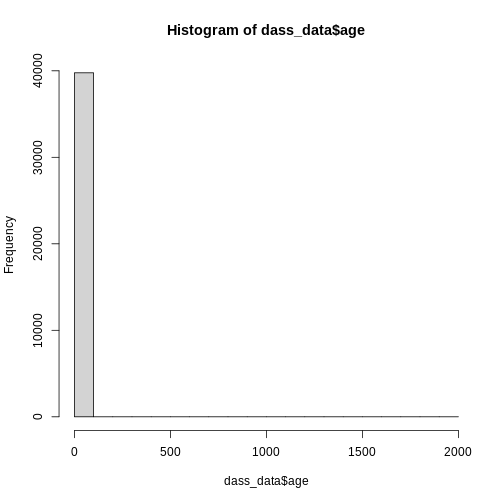
However, this graph is heavily skewed by the outliers in age. We can
address this issue easily by converting to a ggplot
histogram. The xlim() layer can restrict the values that
are displayed in the plot and gives us a warning about how many values
were discarded.
R
library(ggplot2) # Don't forget to load the package

ggplot(
  data = dass_data,
  mapping = aes(x = age)
)+
  geom_histogram()+
  xlim(0, 100)
OUTPUT
`stat_bin()` using `bins = 30`. Pick better value `binwidth`.WARNING
Warning: Removed 7 rows containing non-finite outside the scale range
(`stat_bin()`).
WARNING
Warning: Removed 2 rows containing missing values or values outside the scale range
(`geom_bar()`).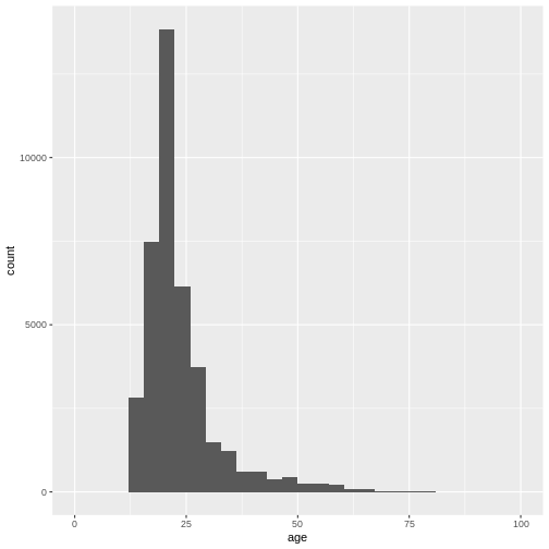
Again, the number of bins might be a bit small:
R
ggplot(
  data = dass_data,
  mapping = aes(x = age)
)+
  geom_histogram(bins = 100)+
  xlim(0, 100)
WARNING
Warning: Removed 7 rows containing non-finite outside the scale range
(`stat_bin()`).
WARNING
Warning: Removed 2 rows containing missing values or values outside the scale range
(`geom_bar()`).
We can also adjust the size of the bins, not the number of bins by using
the
We can also adjust the size of the bins, not the number of bins by using
the binwidth argument.
R
ggplot(
  data = dass_data,
  mapping = aes(x = age)
)+
  geom_histogram(binwidth = 1)+
  xlim(0, 100)
WARNING
Warning: Removed 7 rows containing non-finite outside the scale range
(`stat_bin()`).
WARNING
Warning: Removed 2 rows containing missing values or values outside the scale range
(`geom_bar()`).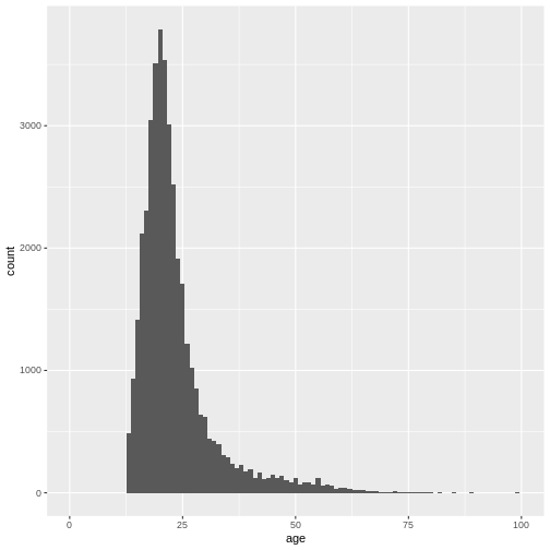
This gives us a nice overview of the distribution of each possible distinct age. It seems to peak around 23 and then slowly decline in frequency. This is in line with what you would expect from data from a free online personality questionnaire.
Density plots
Often, what interests us is not the number of occurrences for a given
value, but rather which values are common and which values are uncommon.
By dividing the number of occurrences for a given value by the total
number of observation, we can obtain a density-plot. In
ggplot you achieve this by using
geom_density() instead of
geom_histogram().
R
ggplot(
  data = dass_data,
  mapping = aes(x = age)
)+
  geom_density()+
  xlim(0, 100)
WARNING
Warning: Removed 7 rows containing non-finite outside the scale range
(`stat_density()`).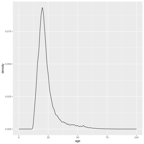
This describes the overall age distribution, but we can also look at the age distribution by education status. What would you expect?
Again, we do this by using the color argument in
aes(), as I want different colored density plots for each
education level.
R
ggplot(
  data = dass_data,
  mapping = aes(x = age, color = education)
)+
  geom_density()+
  xlim(0, 100)
WARNING
Warning: Removed 7 rows containing non-finite outside the scale range
(`stat_density()`).
WARNING
Warning: The following aesthetics were dropped during statistical transformation:
colour.
ℹ This can happen when ggplot fails to infer the correct grouping structure in
  the data.
ℹ Did you forget to specify a `group` aesthetic or to convert a numerical
  variable into a factor?
It seems like this didn’t work. And the warning message tells us why.
We forgot to specify a group variable that tells the
plotting function that we not only want different colors, we also want
different lines, grouped by education status:
R
ggplot(
  data = dass_data,
  mapping = aes(x = age, color = education, group = education)
)+
  geom_density()+
  xlim(0, 100)
WARNING
Warning: Removed 7 rows containing non-finite outside the scale range
(`stat_density()`).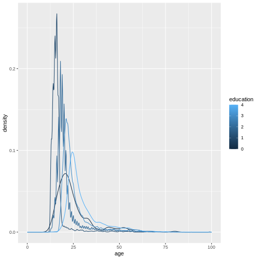
Because education is a numerical variable, ggplot uses a
sliding color scale to color its values. I think it looks a little more
beautiful if we declare that despite having numbers as entries,
education is not strictly numerical. The different numbers
represent distinct levels of educational attainment. We can encode this
using factor() to convert education into a
variable-type called factor that has this property.
R
dass_data$education <- factor(dass_data$education)
ggplot(
  data = dass_data,
  mapping = aes(x = age, color = education, group = education)
)+
  geom_density()+
  xlim(0, 100)
WARNING
Warning: Removed 7 rows containing non-finite outside the scale range
(`stat_density()`).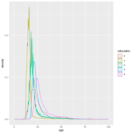
We can make this graph look a little bit better by filling in the
area under the curves with the color aswell and making them slightly
transparent. This can be done using the fill argument and
the alpha argument. Let’s also give the graph a proper
title and labels.
R
ggplot(
  data = dass_data,
  mapping = aes(x = age, color = education, group = education, fill = education)
)+
  geom_density(alpha = 0.5)+
  xlim(0, 100)+
  labs(
    title = "Age distribution by education status",
    x = "Age",
    y = "Density"
  ) +
  theme_minimal()
WARNING
Warning: Removed 7 rows containing non-finite outside the scale range
(`stat_density()`).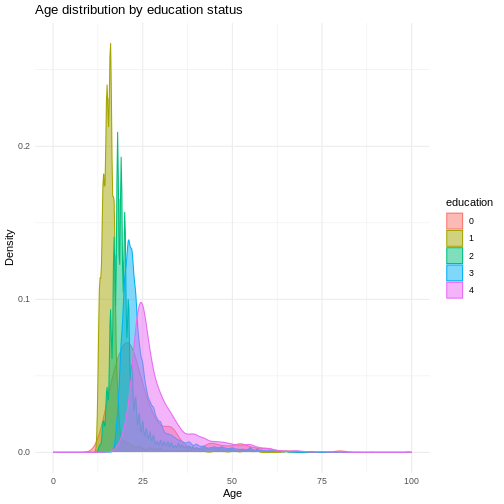
In this graph, we can see exactly what we would expect. As the highest achieved education increases, the age of test-takers generally gets larger as-well. There just are very little people under 20 with a PhD.
Bar Charts
As a last step of exploration, let’s visualize the number of people that achieved a certain educational status. A bar chart is perfect for this:
R
ggplot(
  data = dass_data,
  mapping = aes(x = education)
)+
  geom_bar()
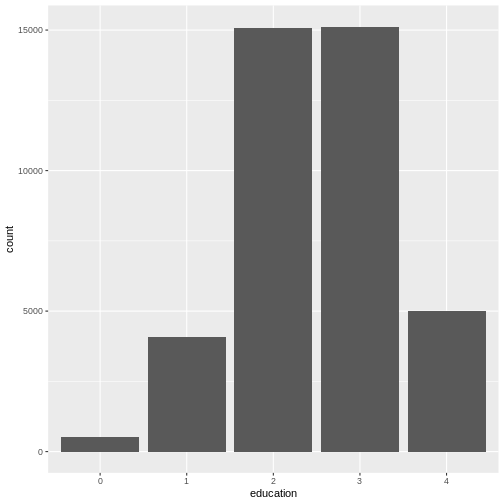
This visualizes the same numbers as
table(dass_data$education) and sometimes, you may not need
to create a plot if the numbers already tell you everything you
need to know. However, remember that often you need to communicate your
results to other people. And as they say “A picture says more than 1000
words”.
We can also include gender as a variable here, in order to compare educational attainment between available genders. Let’s plot gender on the x-axis and color the different education levels.
R
ggplot(
  data = dass_data,
  mapping = aes(x = gender, fill = education)
)+
  geom_bar()
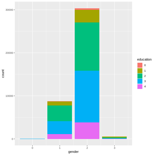
This graph is very good at showing one thing: there are more females
in the data than males. However, this is not the comparison we are
interested in. We can plot relative frequencies of education by gender
by using the argument position = "fill".
R
ggplot(
  data = dass_data,
  mapping = aes(x = gender, fill = education)
)+
  geom_bar(position = "fill")
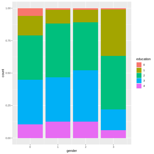
This plot shows that education levels don’t differ dramatically between males and females in our sample, with females holding a university degree more often than males.
Common Problems
This section is lifted from R for Data Science (2e).
As you start to run R code, you’re likely to run into problems. Don’t worry — it happens to everyone. We have all been writing R code for years, but every day we still write code that doesn’t work on the first try!
Start by carefully comparing the code that you’re running to the code
in the book. R is extremely picky, and a misplaced character can make
all the difference. Make sure that every ( is matched with
a ) and every " is paired with another
". Sometimes you’ll run the code and nothing happens. Check
the left-hand of your console: if it’s a +, it means that R
doesn’t think you’ve typed a complete expression and it’s waiting for
you to finish it. In this case, it’s usually easy to start from scratch
again by pressing ESCAPE to abort processing the current command.
One common problem when creating ggplot2 graphics is to put the + in the wrong place: it has to come at the end of the line, not the start. In other words, make sure you haven’t accidentally written code like this:
R
ggplot(data = mpg)
+ geom_point(mapping = aes(x = displ, y = hwy))
If you’re still stuck, try the help. You can get help about any R
function by running ?function_name in the console, or
highlighting the function name and pressing F1 in RStudio. Don’t worry
if the help doesn’t seem that helpful - instead skip down to the
examples and look for code that matches what you’re trying to do.
If that doesn’t help, carefully read the error message. Sometimes the answer will be buried there! But when you’re new to R, even if the answer is in the error message, you might not yet know how to understand it. Another great tool is Google: try googling the error message, as it’s likely someone else has had the same problem, and has gotten help online.
Recap - Knowing your data!
It’s important to understand your data, its sources and quirks before you start working with it! This is why the last few episodes focused so much on descriptive statistics and plots. Get to know the structure of your data, figure out where it came from and what type of people constitute the sample. Monitor your key variables for implausible or impossible values. Statistical outliers we can define later, but make sure to identify issues with impossible values early on!
Challenges
Challenge 1
Review what we learned about the DASS data so far. What are the key demographic indicators? Is there anything else important to note?
Challenge 3
Provide descriptive statistics of the time it took participants to complete the DASS-part of the survey. What variable is this stored in? What is the average time? Are there any outliers? What is the average time without outliers?
Challenge 4
Plot a distribution of the elapsed test time. What might be a sensible cutoff for outliers?
Plot a distribution of elapsed test time by whether English was the native language. What do you expect? What can you see? What are your thoughts on the distribution?
R
dass_data$engnat <- factor(dass_data$engnat)

ggplot(
  data = dass_data,
  mapping = aes(
    x = testelapse, fill = engnat, group = engnat
  )
)+
  geom_density(alpha = 0.5)+
  xlim(0, 3000)+
  labs(
    title = "Distribution of test completion times",
    subtitle = "By Mother Tongue",
    x = "Test completion time (s)",
    y = "Density"
  )+
  theme_minimal()
WARNING
Warning: Removed 399 rows containing non-finite outside the scale range
(`stat_density()`).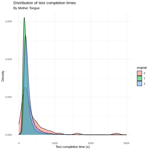
Challenge 5
Learn something about the handedness of test-takers. Get the number
of test-takers with each handedness using table and
visualize it using geom_bar().
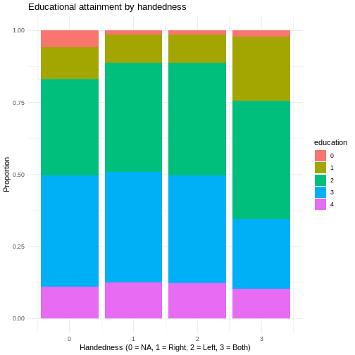
Plot the handedness of test-takers by educational status. Do you see any differences?
R
ggplot(
  data = dass_data,
  mapping = aes(
    x = hand,
    fill = education,
    group = education
  )
)+
  geom_bar(position = "fill")+
  labs(
    title = "Educational attainment by handedness",
    x = "Handedness (0 = NA, 1 = Right, 2 = Left, 3 = Both)",
    y = "Proportion"
  )+
  theme_minimal()
- Get to know new data by inspecting it and computing key descriptive statistics
- Visualize distributions of key variables in order to learn about factors that impact them
- Visualize distribution of a numeric and a categorical variable using
geom_density() - Visualize distribution of two categorial variables using
geom_bar()